FAQ
arrow_back_ios
Can I change the widget's appearance?
You can customize the colors, fonts, and styles of the widget using CSS. For example, if you add the following rules to the widget settings:
      .calendar__card{background:#fffbed}
      .calendar__period-navigation{background:#fcf5dd}
      .calendar-header{background:#faecb9;color: #6a5d22;}
      .colors{background:#faecb9;}
      .colors__name{color: #6a5d22;}
The widget will look like this: 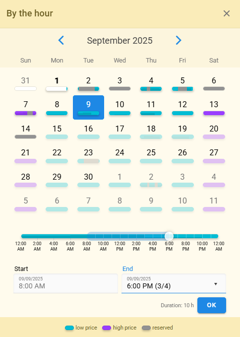
The widget offers four predefined themes: light, dark, vk (indigo), and ok (orange). Both the light and dark themes allow you to select the primary color for elements. You can also apply your own custom styles on top of any color theme.
You can choose where to place the widget on your page. It can be opened in a pop-up window, on a separate page, or most commonly, embedded as a block within your page.
The widget is designed for mobile devices. It is lightweight, fast, and responsive. Try opening it from your tablet or smartphone.
If you are on the Business subscription plan, we can assist you with customizing the widget styles.
