arrow_back_ios
Can I customize the widget design so that it becomes part of my website?
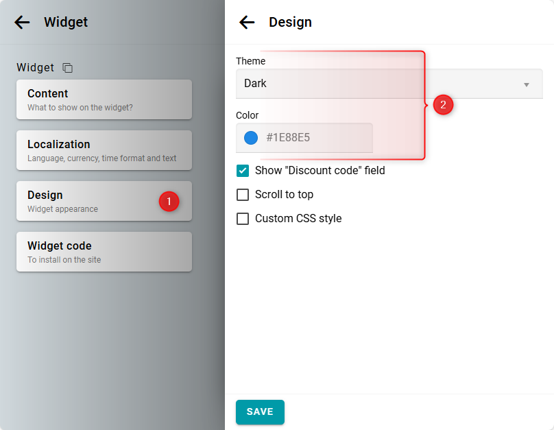
In the Design panel, select either the light or dark theme to match your website's design. Next, choose an accent color for the buttons and form fields.

If you require advanced design customization, you can modify the widget's appearance using CSS. This allows you to change the fonts, colors, and shapes of any widget elements. Basic knowledge of HTML and CSS is required.
Widget styles are structured according to the BEM methodology. Each element has its own class.
To customize the design of a specific element, identify its CSS class. You can easily do this using your browser's developer tools. For example, in Chrome, right-click the element and select View Code.

For example, the class for the day name in the calendar is day.
Now, let's write a simple CSS rule to change the background, color, and font:
.day {
background: #fdeedb;
font-weight: 700;
color: #8a5714;
}
background: #fdeedb;
font-weight: 700;
color: #8a5714;
}
Finally, open the widget settings and navigate to the Design panel. Check the Custom CSS style option and paste your CSS code.

The result will look like this:
If you want to add a custom font or external style using the CSS @import directive, follow these steps:
- Add your @import statement at the top of your Custom CSS. For example:
@import url('https://fonts.googleapis.com/css2?family=Noto+Sans:ital,wght@0,100..900;1,100..900&display=swap'); - Insert the [bukza_theme_styles] block below all your @import statements.
- Add the rest of your CSS to override the theme styles as needed.
The [bukza_theme_styles] block will automatically be replaced with the theme's styles. If this block is not present, the theme styles will be applied before your custom CSS.


